At a glance
Expert’s Rating
Pros
- Sleek profile
- Solid fitness tracking
- Decent battery life for a color screen
Cons
- Touch screen could be more responsive
- Limited, non-customizable interface
Our Verdict
The Fitbit Luxe is a dressed-up Inspire 2—you’re primarily paying for sleeker aesthetics, even when it comes to hardware upgrades. It’s still a solid tracker, but its luxury focuses on skin-deep glamour, rather than upgrades that enhance the quality of the experience.
Price When Reviewed
$149.99
Best Prices Today
$99.95
Free


$149.99
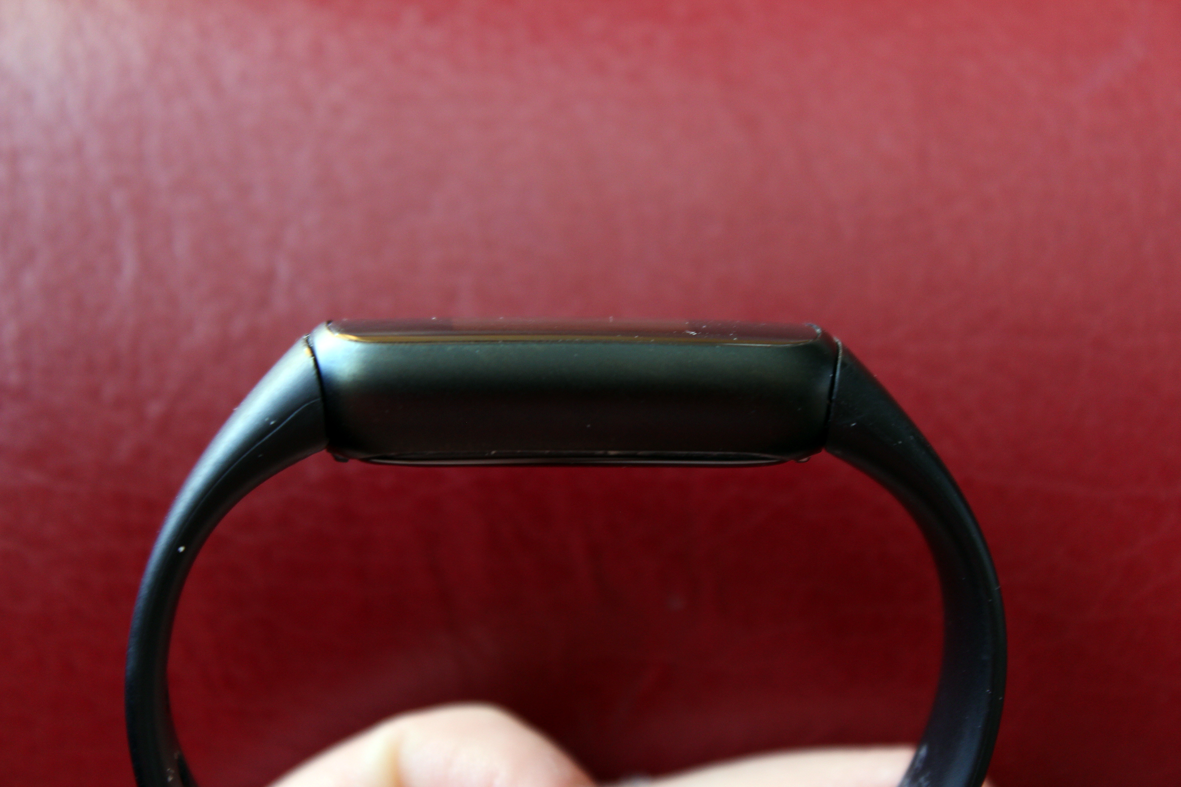
The Fitbit Luxe has the look you’d expect from its name. Encased in stainless steel, available in black, gold, and silver, and backed with a line of fashionable accessory bands, it blends readily with stylish outfits. Its slender, thinner profile is also discreet on your wrist—of Fitbit’s lineup, it’s the smallest and least obtrusive model.
But a refined appearance is mostly what you get in this posh (and more expensive) take on Fitbit’s cheaper Inspire 2 tracker. You’re looking at a bump up in glamour rather than feature set, which doesn’t benefit fitness enthusiasts. A couple of key hardware upgrades even compromise performance compared to the Inspire 2.
Good looks, constrained premium features
You’ll notice one of the Fitbit Luxe’s main upgrades at first glance—the 0.76-inch color AMOLED display, which is roughly the same size as the Inspire 2’s monochrome PMOLED screen, but on a thinner body. (The Luxe measures 1.43 x 0.69 x 0.4 inches, or 36.3 x 17.5 x 10.1 mm, which makes it a touch shorter, wider, and skinnier than the Inspire 2.) And at first glance, the screen is crisp and bright, making it easy to read…in theory.
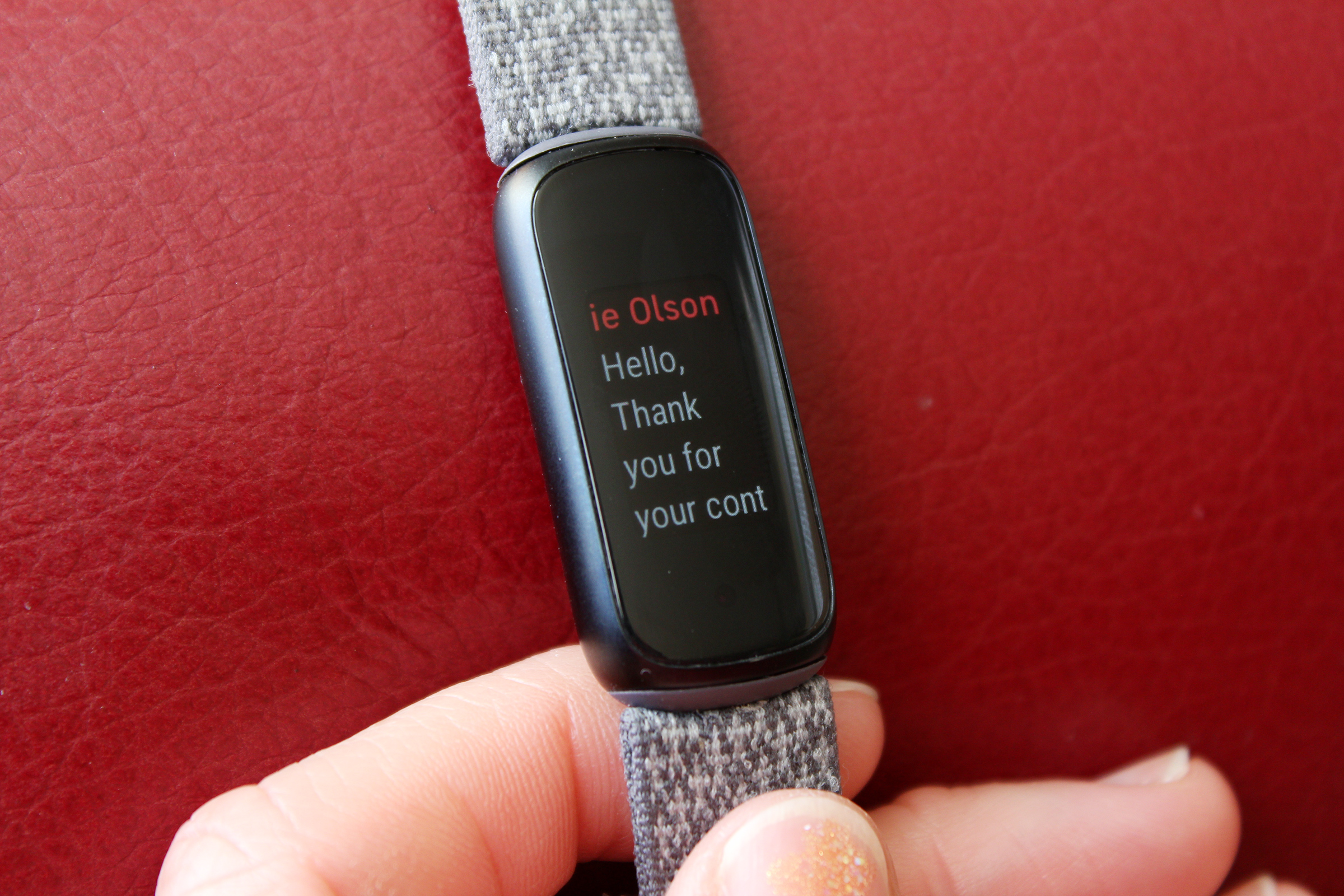
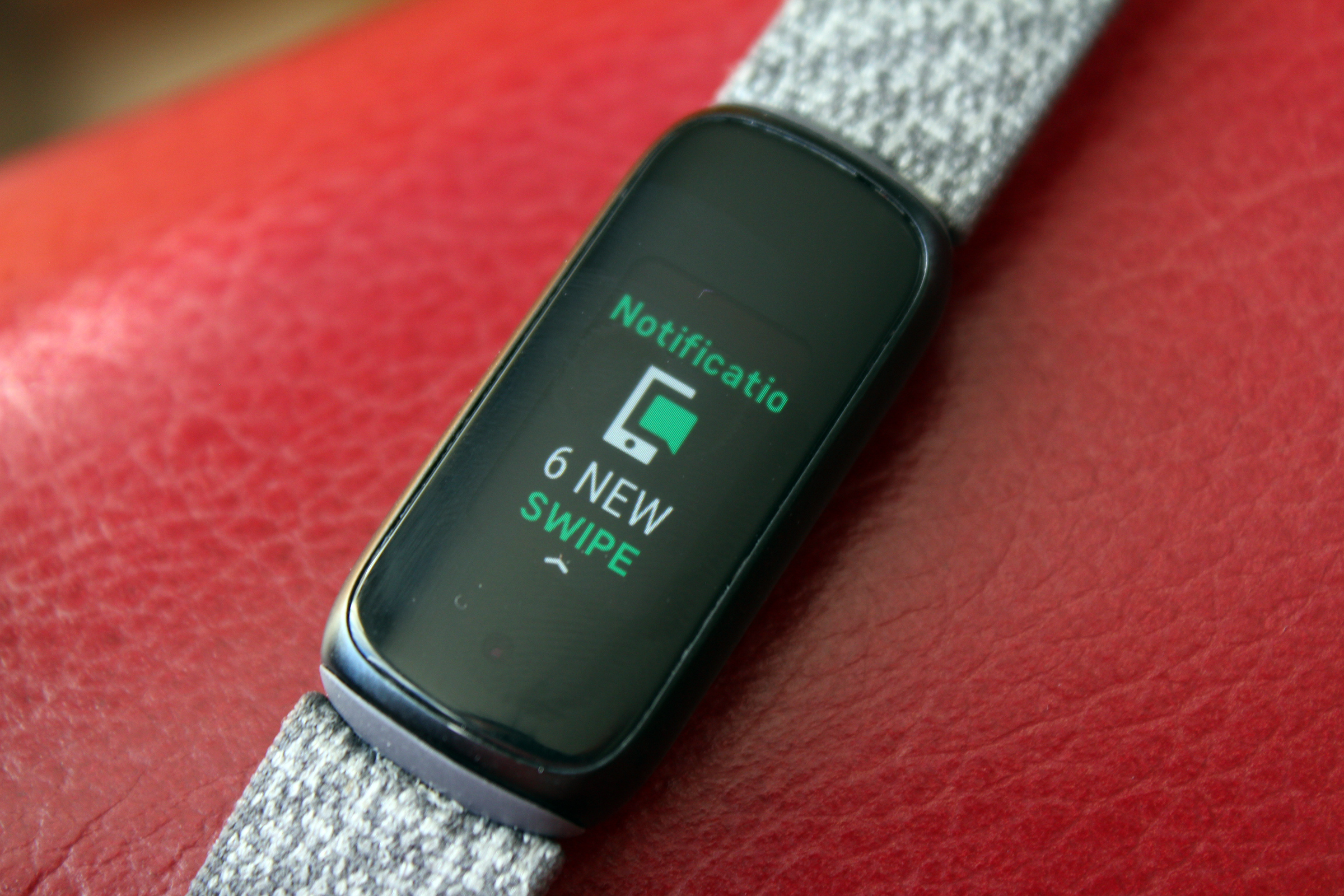
Unfortunately, the Luxe’s interface bungles the appeal of the display. (Disappointment over the interface is a recurring theme with the Luxe; more on that below.) The size and text wrapping is at times comically bad. You’ll notice this most when skimming through message notifications, where you often get just one word per line. Trying to keep up with chats or email actually began to test my patience, unlike with other Fitbit trackers with limited screen real estate. Having an option for a smaller font or tighter line spacing would have been useful.


Alaina Yee / IDG
The Luxe’s touch-only controls are also problematic. On paper, the nixing of side buttons sounds like a step up, but in practice, it makes menu navigation less enjoyable. To go back in a menu, you must double-tap on the screen, which sometimes results in selecting the option on-screen instead. Taps and swipes don’t always register on the first try, either. Interaction with a tracker is something you’ll do daily, and prioritizing form over function is wholly impractical here. Having to repeat motions to use the device keeps it from being a seamless part of your routine.
The one Luxe enhancement that satisfies is the SpO2 sensor. For most people, the readings of blood oxygen levels will be good enough for a general idea of your health and subsequent changes to it. It doesn’t match a pulse oximeter in accuracy, though. The Luxe underreported my oxygen saturation by two to three percentage points compared to a pulse oximeter. The Luxe has the advantage in terms of style for sure, though. You don’t need to remove your nail polish for a proper reading, as you do with pulse oximeters.
Solid fitness tracking and decent battery life
While its fancier hardware features fail to dazzle, the Luxe does a good job at keeping tabs on your physical activity and wellness. Fitness trackers and smartwatches still aren’t precise tools for measuring distance traveled, heart rate, sleep, and the like, but the technology has improved enough to indicate how well you’re faring.
The Luxe tracks steps, heart rate, sleep duration and stages, menstrual health, Active Zone minutes (times when your heart rate climbs high enough for your activity to count as moderate or high intensity), and exercise. Some exercises can be tracked automatically, like walking and running, but don’t count on accurate assessments. My strength training sessions didn’t register, and dance confounded the Luxe just as it has every other tracker I’ve used in the past eight years. One session was recorded as “Sport,” while another was broken up half into “Swim” and half into “Aerobic Workout.”
Speaking of swimming, the Luxe has an IPX8 rating, with water resistance up to 50 meters. This tracker handles submersion in water just fine, though your skin afterward might not. (It’s highly recommended to dry off the tracker and let your skin air out before continuing to wear the Luxe.)


Alaina Yee / IDG
As for GPS tracking, the Luxe relies on phone-based GPS to map your route and calculate your pace. To toggle it on and off for walks, runs, and bike rides, tap on the exercise in the Exercise menu and scroll down.
You’ll be able to power all of this stat recording for up to five days, which is respectable but not as impressive as the less-expensive Inspire 2, which is rated for up to 10 days. Going up to a color display hits battery life hard. You can stretch that time longer when not active—in the two months* that I tested the Luxe, I could go as many as nine or 10 days during slothy periods (just daily walks). But you can often get more battery life on Fitbit trackers with low activity, so that’s not a quality unique to the Luxe.
*I’ve never had a Fitbit tracker without some kind of quirk when I first got it—all have had crashes, blank screens, hard resets, and the like at the start. When my Fitbit Luxe sample showed a dead screen twice in the same evening, I decided to extend my time with it to ensure I was evaluating it fairly. Since applying a firmware update, I haven’t run into the same wonkiness, much less needed to do a manual reboot or reset.
An interface that feels too basic
With a name like Luxe, you’d expect its interface to be as slick as its physical body. But the UI on Fitbit’s trackers have always had a bare-bones vibe, and the Luxe is sadly no exception.
Menus are snappy when the display registers your touch, as well as basic enough to figure out without the manual. You simply swipe up, down, or side to side for access to different stats, settings, and apps. Unfortunately, none of the interface is customizable. For example, just six apps are available for the Luxe—Notifications, Exercise, Relax, Alarms, Timers, and SpO2—but you can only remove SpO2 from the lineup to reduce swiping. You can’t reorder them either, so you’re stuck with what appears first when swiping left or right.
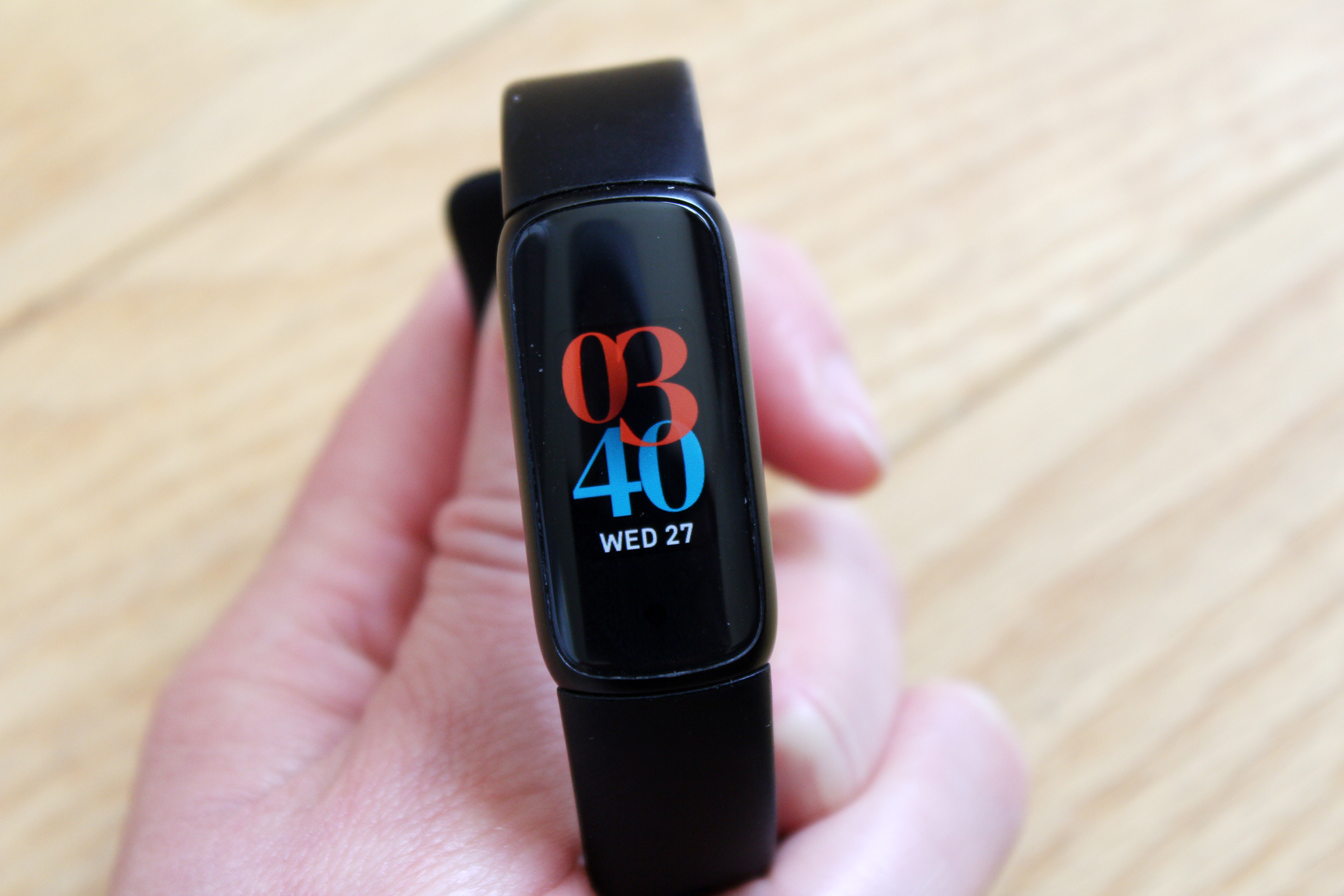
Fitbit also doesn’t offer universal clock faces, meaning the Luxe’s options don’t include any of the excellent ones from other trackers. Instead you can only choose from faces that prioritize aesthetics over function—and most clocks show just a single stat. You have to tap to see anything of further use. I’ve taken to changing the clock face based on what I’m doing, which is highly inconvenient. It’s not a fast process.


Alaina Yee / IDG
It makes sense that trackers would have fewer apps and menu options—for example, I don’t expect to be able to write custom text messages. But not allowing a smidge of customization within those limits on a model with a premium vibe is baffling.
Equally puzzling are the rather plain animations you get on the Luxe. On older Fitbits, you would see different ones upon meeting your step goal, doubling it, tripling it, and so forth. Some were downright cute too, like birds flying by with a banner showing the number reached. But on the Luxe? Just a sneaker inside a circle.
Value
Compared to the $180 Charge 5 and $100 Inspire 2, the $150 Fitbit Luxe might seem reasonably priced in the middle with its stainless steel body, color screen, and touch-only controls. But let’s talk about what $150 bought you just a couple of months ago.
The Luxe lacks key features that the now-discontinued Charge 4 had for the same price. It doesn’t have on-board GPS, an NFC chip (and thus Fitbit Pay support), an altimeter to track elevation changes or steps climbed, nor one or two additional apps like Weather and Spotify that would be very useful.
Yes, your money is buying you a sleek, more attractive tracker. The Charge 4 was plastic and would never be mistaken for anything but a slab of utilitarian tech on your wrist. Even the Charge 5 with its aluminum body is too bulky to blend in with jewelry the way the Luxe can (especially if you pair the latter with the optional and rather gorgeous link bracelet band or double-wrap leather band).


Alaina Yee / IDG
Don’t get me wrong. I would prefer more stylish trackers to choose from. But it feels like Fitbit has missed out on an opportunity here to dress up the Luxe in a stylish and pragmatic way. Even including an altimeter and a few more apps would help, if not also on-board GPS. Drop the touch controls in trade.
More puzzling is the fact that the Inspire 2 includes a full year subscription to Fitbit Premium ($80), while the Luxe only throws in six months. (The Charge 5 also only offers six months.) Pay less for a tracker and you get more time with the company’s paid service, gratis. Fitbit likely is aiming to get more money out of Inspire 2 users by hooking them on the extra fitness challenges and games, more detailed wellness stats, long-term trend data, and included workouts, but on the face of things, that difference sure makes the Luxe feel less deluxe.
Should you buy a Fitbit Luxe?
Spending an extra $50 for the Luxe doesn’t put you quite between the Inspire 2 and Charge 5 in terms of better, more detailed tracking. You’re primarily paying for upgraded aesthetics, even when it comes to hardware upgrades.
That said, the tracking the Luxe provides is solidly on par with Fitbit’s other offerings, and its look is appealing, especially if you (like me) prefer to keep it on even when going places where style matters. It’s really a shame that its luxury focuses on skin-deep glamour and ignores upgrades that enhance the quality of the experience.
Note: When you purchase something after clicking links in our articles, we may earn a small commission. Read our affiliate link policy for more details.
Alaina Yee is PCWorld’s resident bargain hunter—when she’s not covering PC building, computer components, mini-PCs, and more, she’s scouring for the best tech deals. Previously her work has appeared in PC Gamer, IGN, Maximum PC, and Official Xbox Magazine. You can find her on Twitter at @morphingball.
Leave a Reply Cancel reply
document.addEventListener(‘DOMContentLoaded’, function () {
var commentForms = document.getElementsByClassName(‘jetpack_remote_comment’);
for (var i = 0; i < commentForms.length; i++) {
commentForms[i].allowTransparency = false;
commentForms.scrolling = 'no';
}
});
<!–